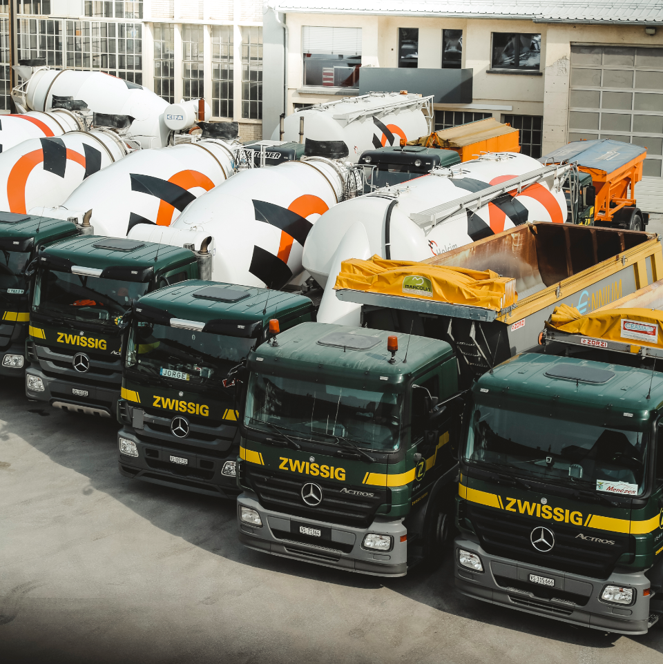
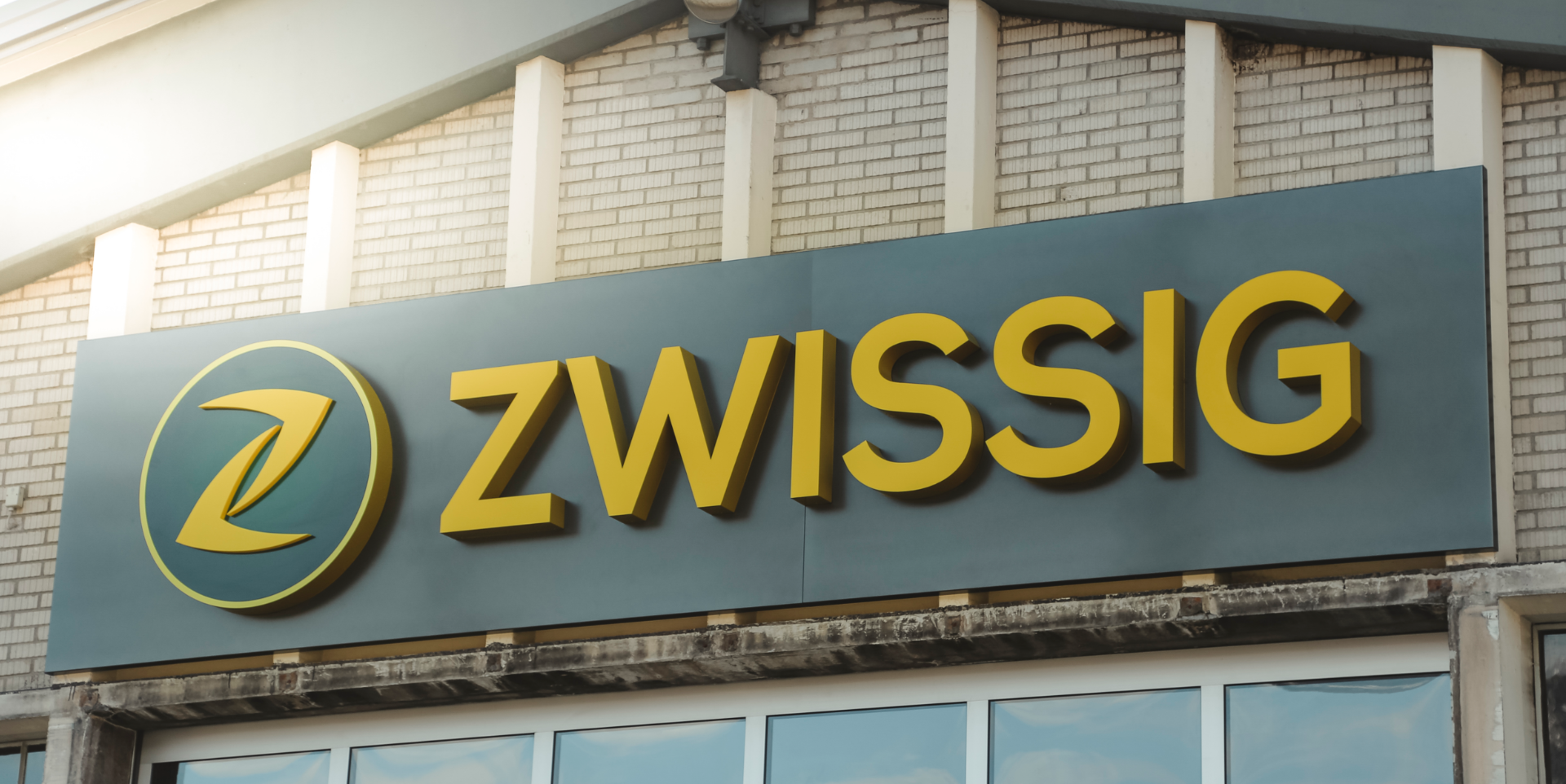
Zwissig Transport has stood for reliable and honest service since 1912. Together with Pierre-Alain Grichting, who restructured the company, we were allowed to develop the complete corporate design of Zwissig AG. Branding, website, labeling work and a neon sign that shines as far as Crans-Montana are just a few of the work we created.

The round belongs into the square.


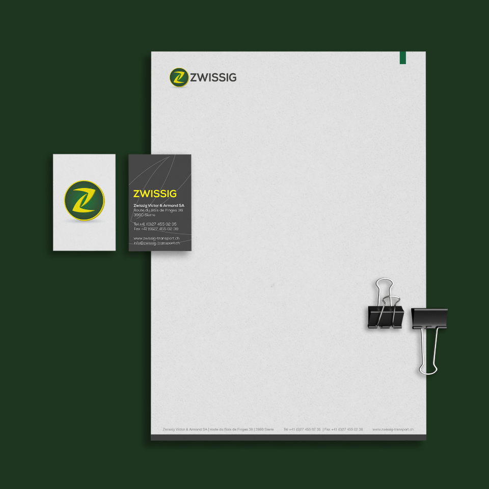
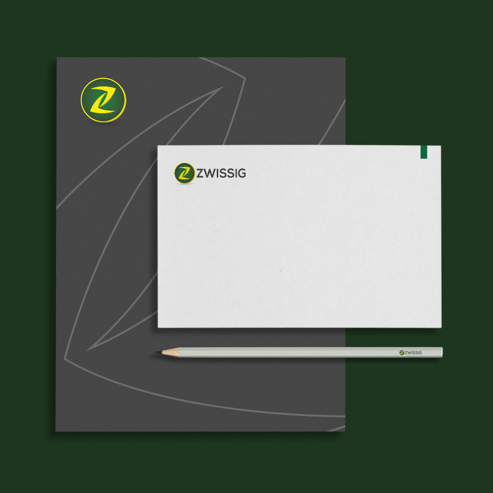
Two direction arrows form the strong initial «Z» which now decorates the front of the mighty radiator grill. In the end it is a simple message: We transport thing from A to B and our name stands for safety and quality. We have also ad these values and the history of Zwissig in the labeling concept in the offices and combined old photos from the beginnings of the company with the latest digital printing.