The smallest village with the biggest heart.
Municipality of Lalden – Branding, UX/UI & Merchandising
- Branding
- Design
- Photo
- Video
what
It must be possible for a municipality not to come across as dusty all the time. We on the council aren’t the suit-and-tie type – quite the opposite, we’re a fairly young crowd compared to others. So how do we modernise our image, strengthen our identity with all the events and cultural activities, and at the same time stand proud as the smallest village in Upper Valais by area? And please: not too classic – that’s just not us. Can you help us with that?
how
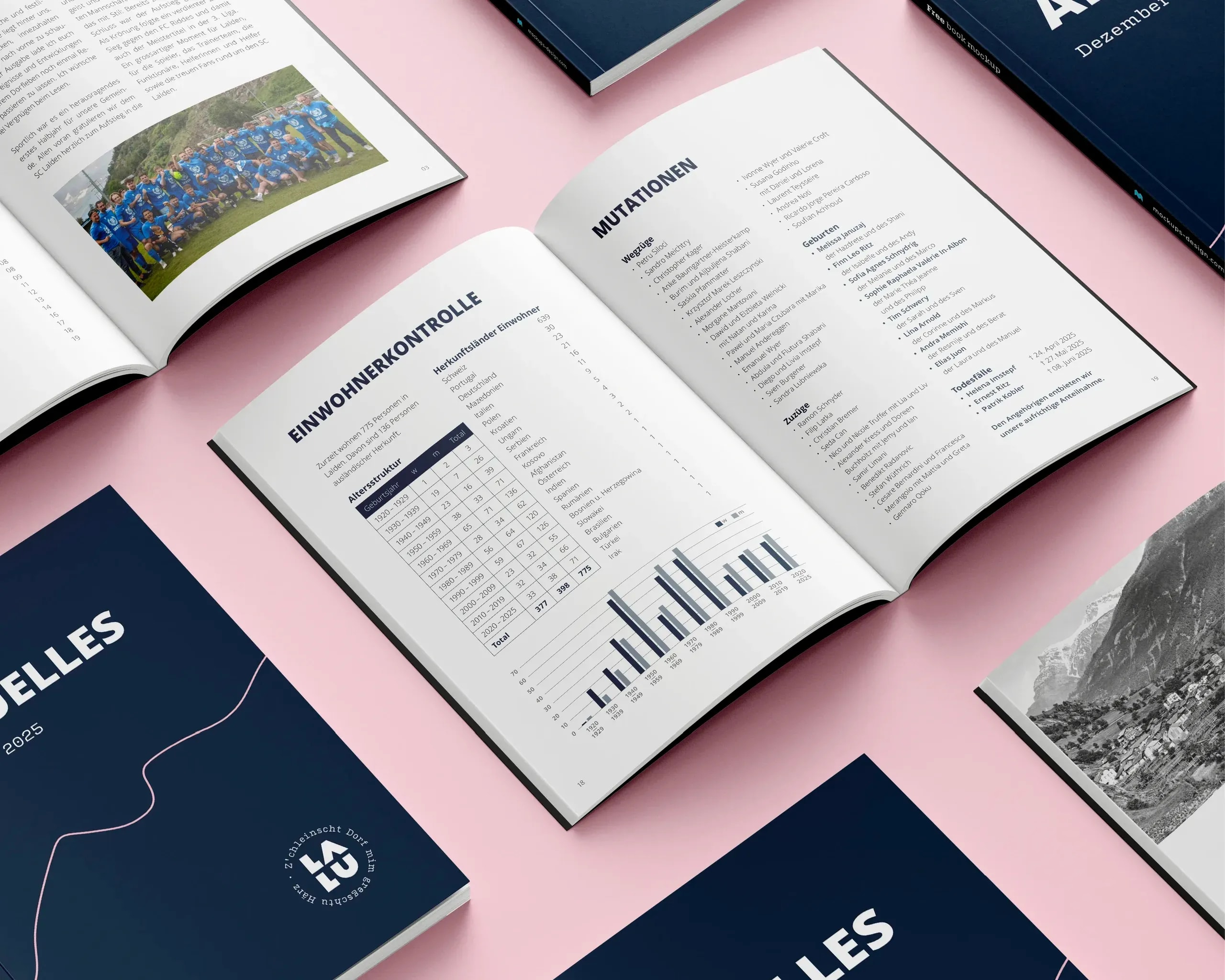
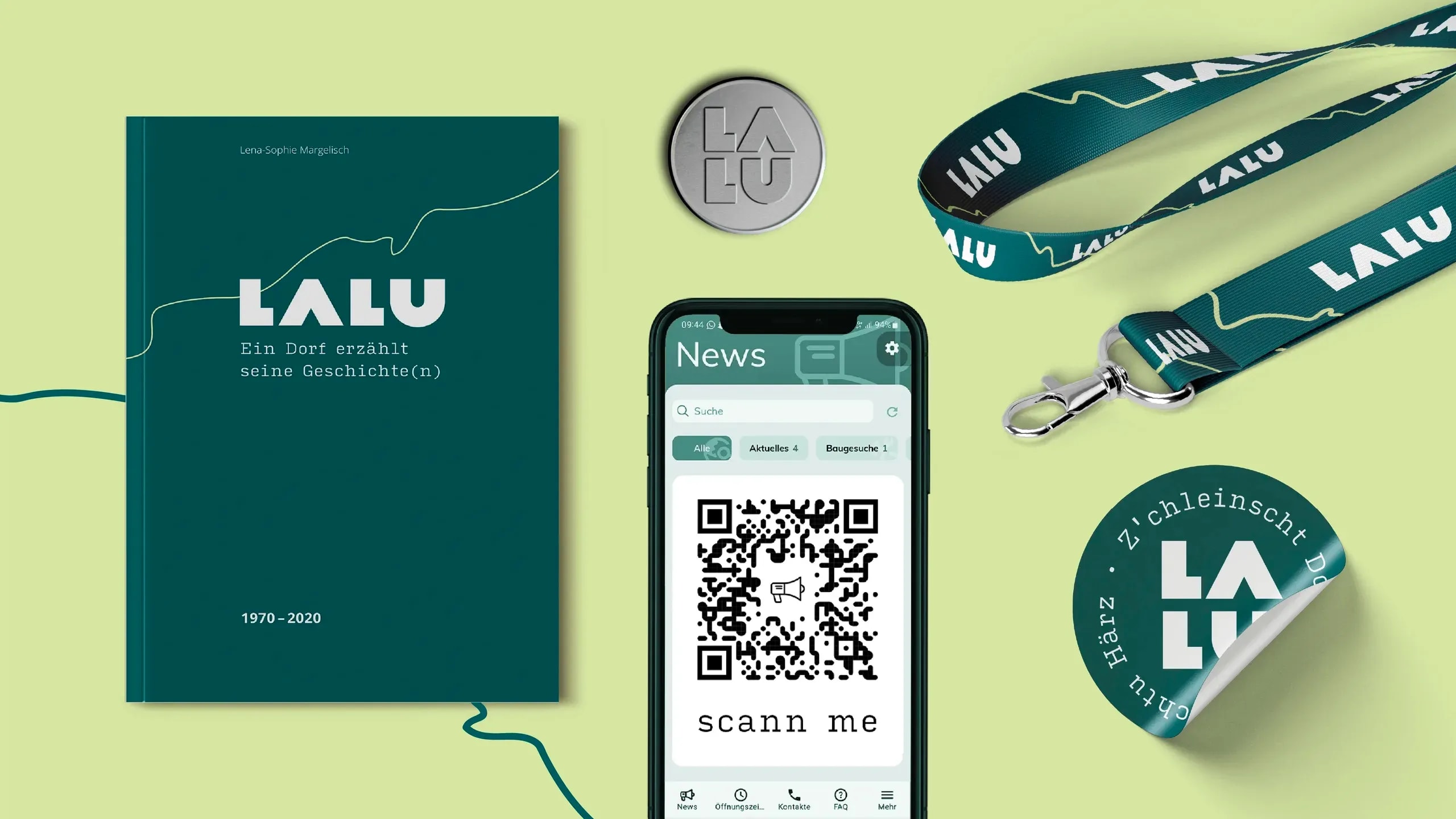
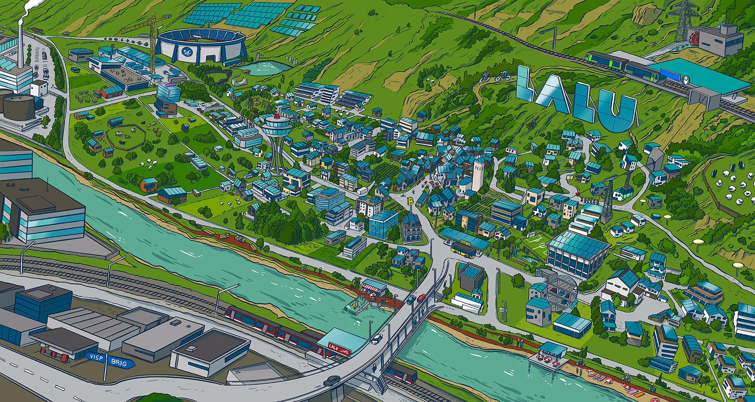
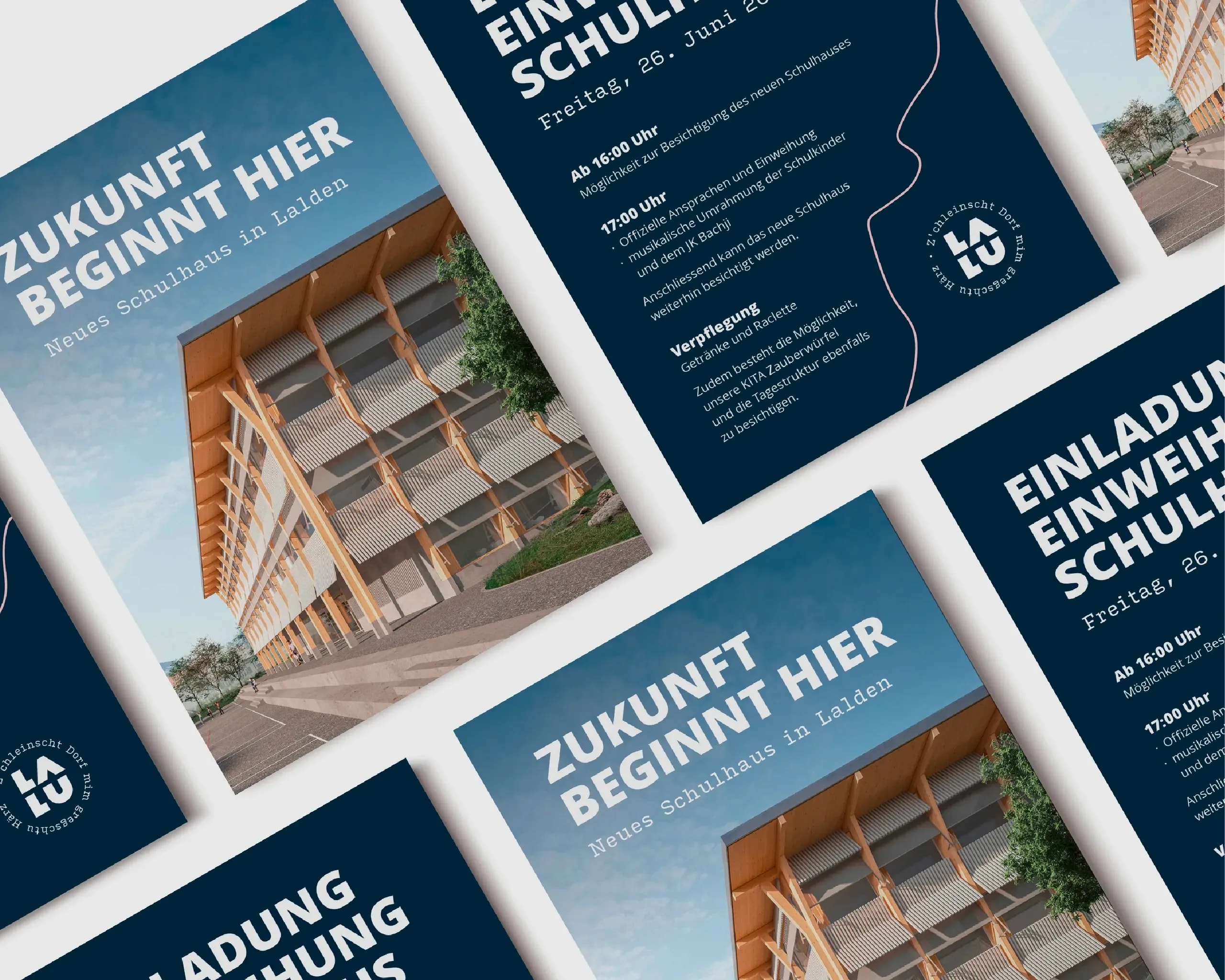
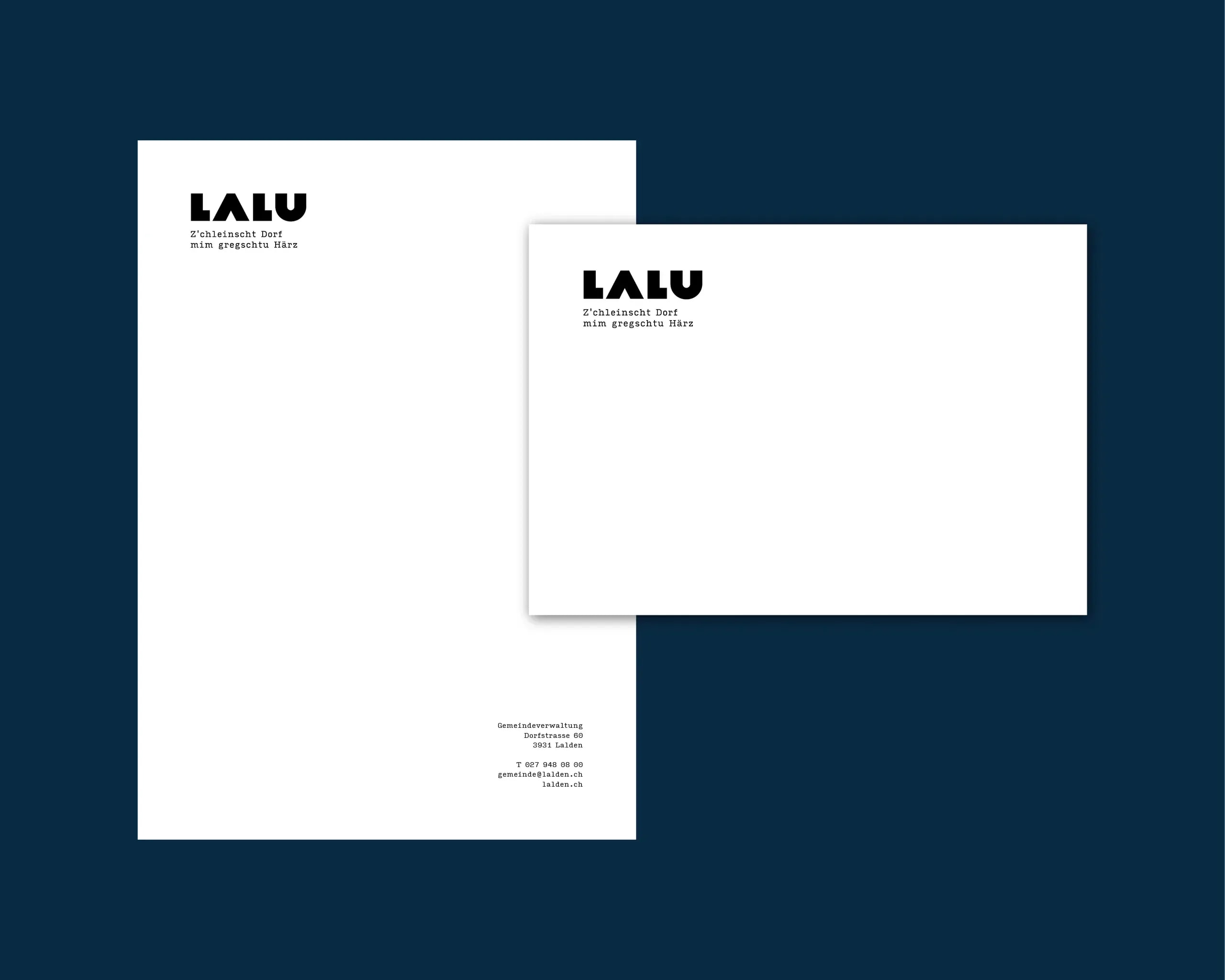
The collaboration started with a clear brand identity for the municipality of Lalden. After several design approaches – from modular to classic – one thing was quickly clear: the answer was closer than we thought. With the dialect as the central element, the brand "LALU" was born – approachable, independent and deeply rooted in the region. The claim "Z’chleinscht Dorf mim gregschtu Härz" added emotion and tied the identity directly to the people and their stories. On that basis we developed a full corporate design with its own colour world, new graphic elements and a modern website, in collaboration with indual. The goal: communication for the municipality that is consistent, flexible and unmistakable.
wow
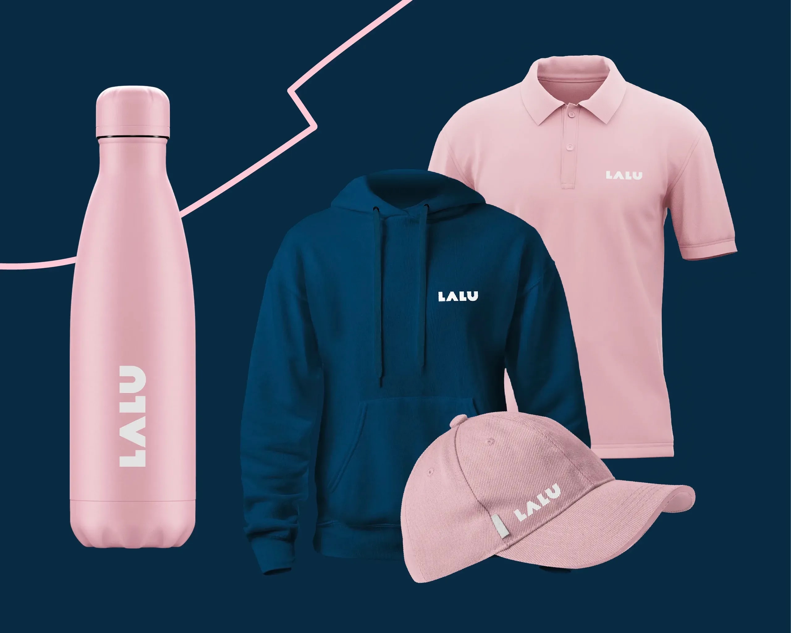
Today Lalden shows how a municipality can live its identity with confidence. The brand isn’t just communicated, it’s carried by the residents – whether with "LALU" water bottles on trips around the world or at newly designed events in the village. Even the mayor became a style icon when he turned up at the mayors’ conference in a branded hoodie.