Built on teamwork.
Regotz Group – Future Vision, Brand Strategy, Branding & Website
- Photo
- Design
- Naming & Wording
- Rebranding
- Strategy
Customer
Regotz Group
Link
regotzgroup.chwhat
Schnydärlini, our group has grown. Over the years, we’ve also collected quite a few different logos and colours. Now we want to bring some order to it all and show which companies belong together. Each of our businesses has its own strengths, and they’re working towards a shared future. That should be visible too. Give us an identity that reflects what we’ve become. And one we can keep building on.
how
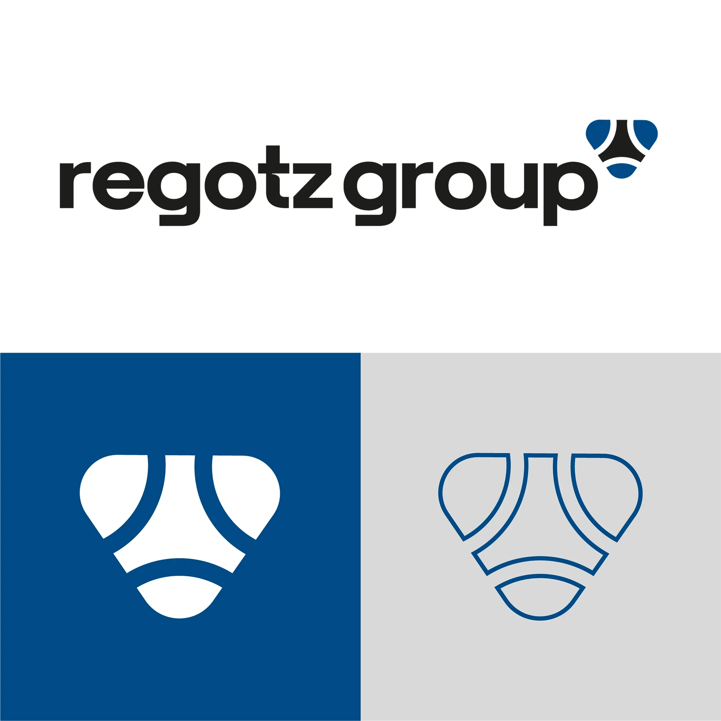
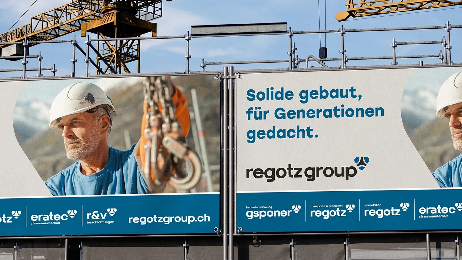
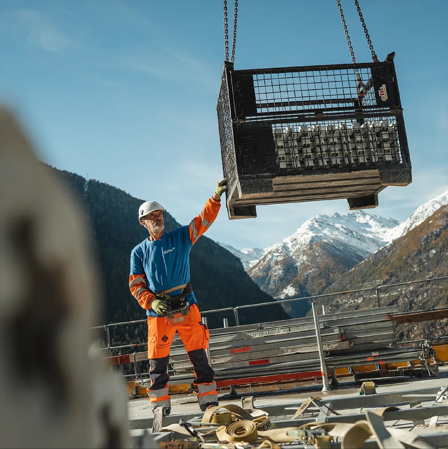
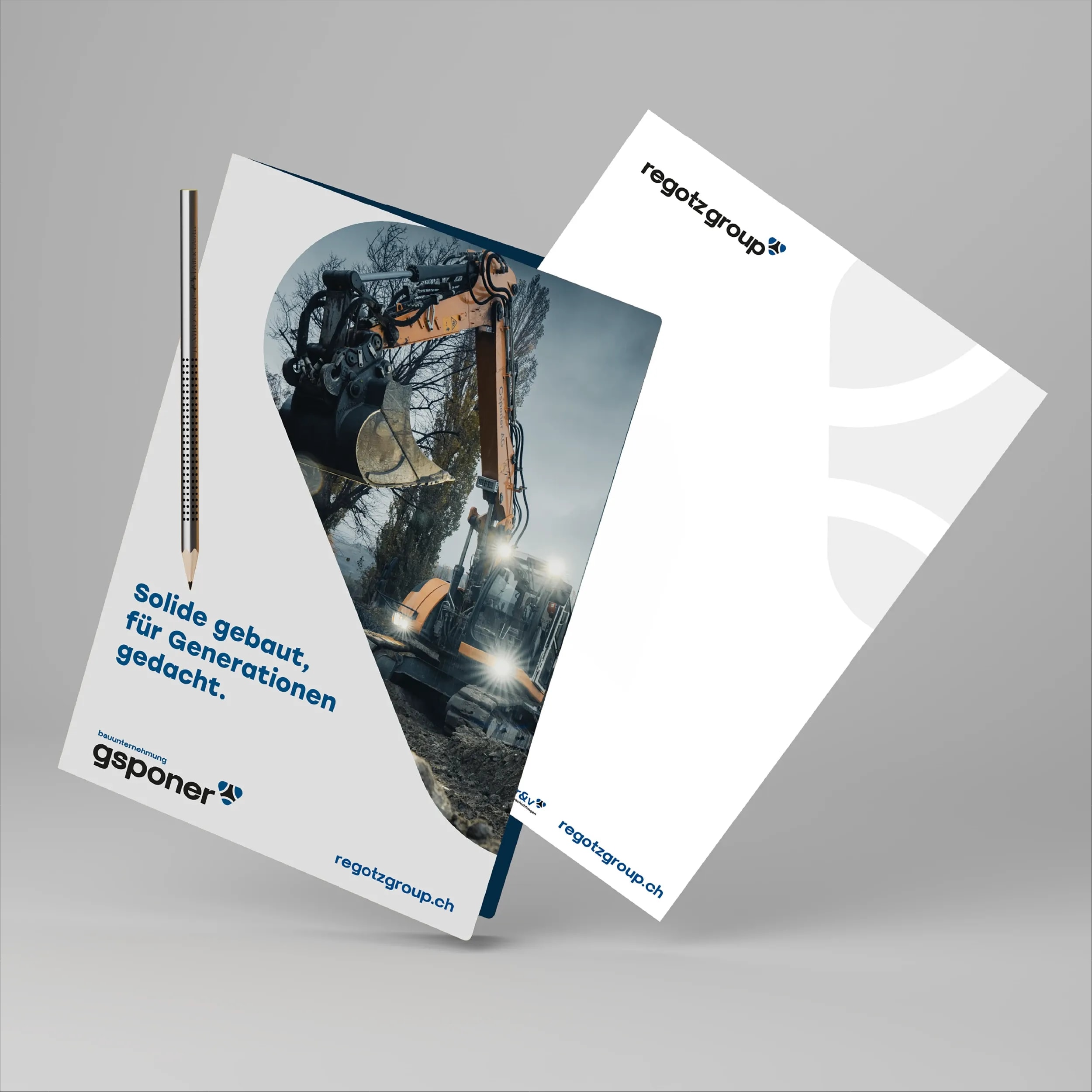
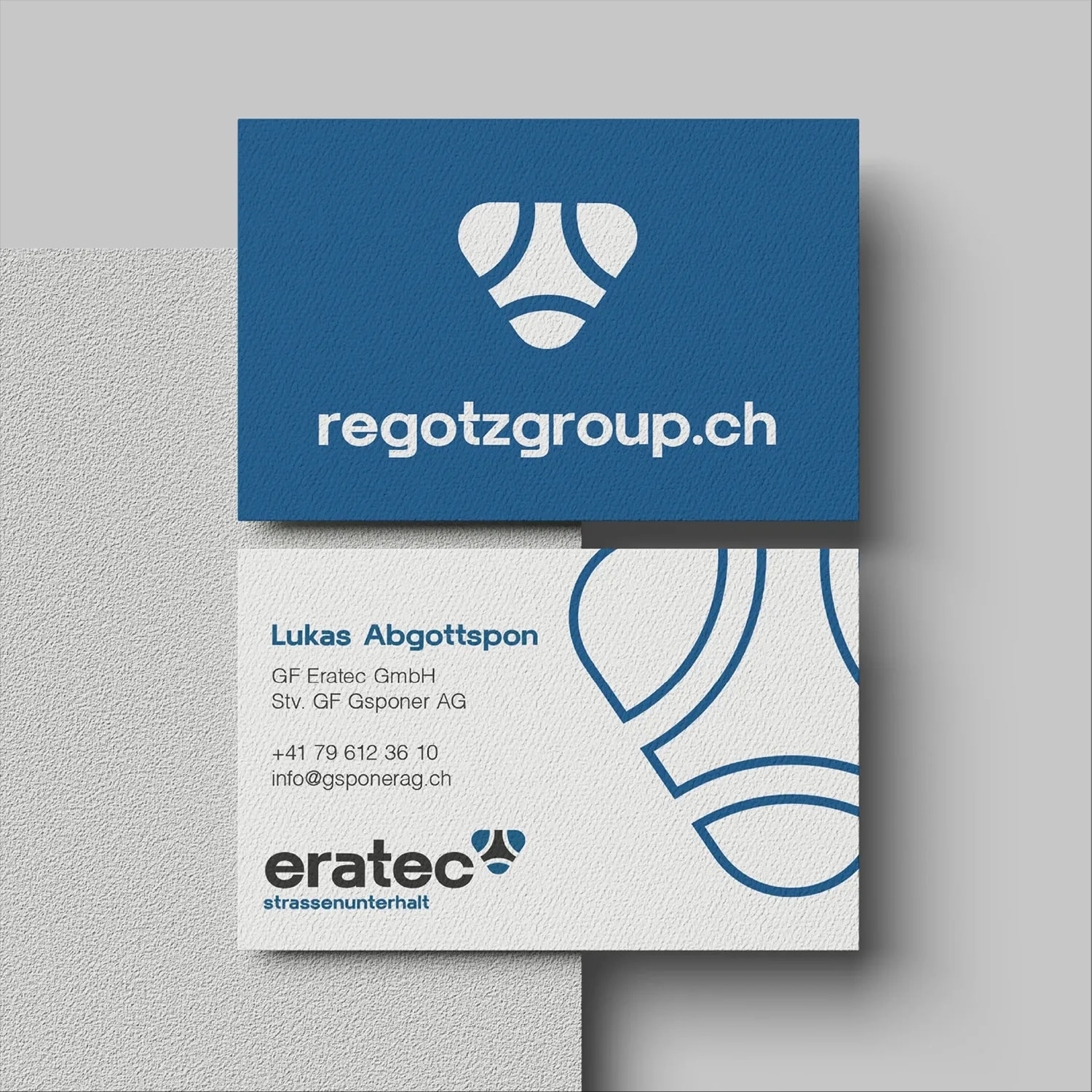
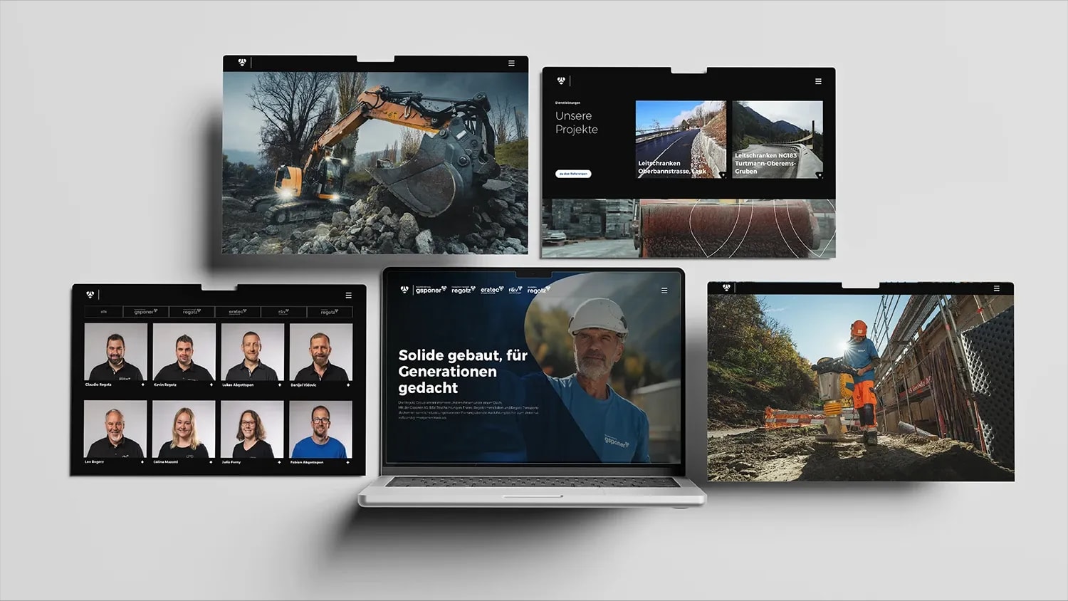
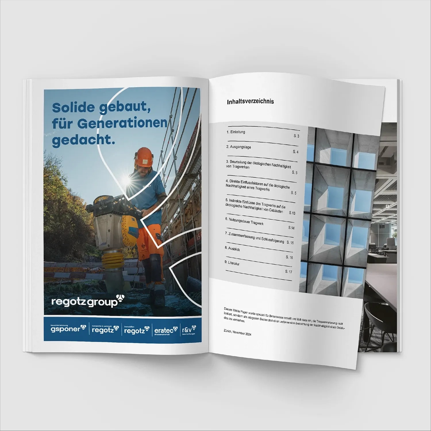
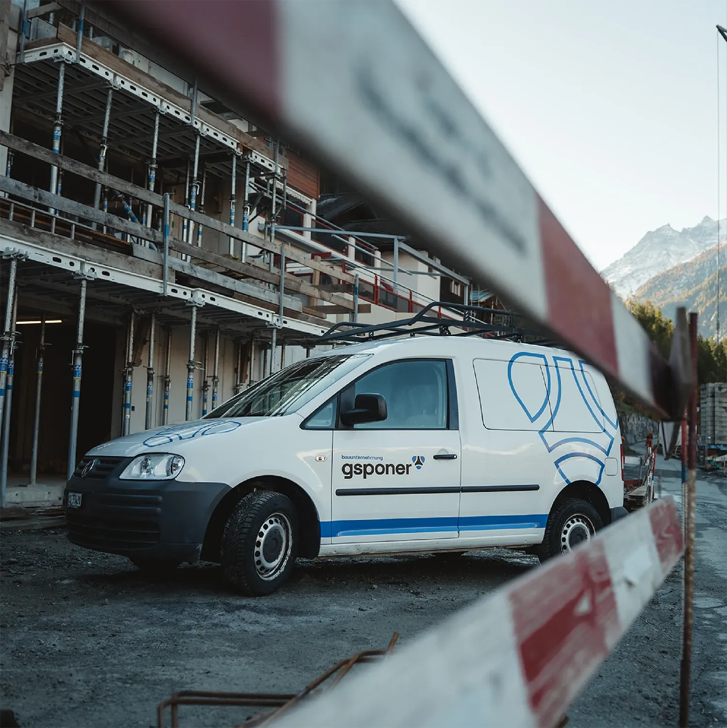
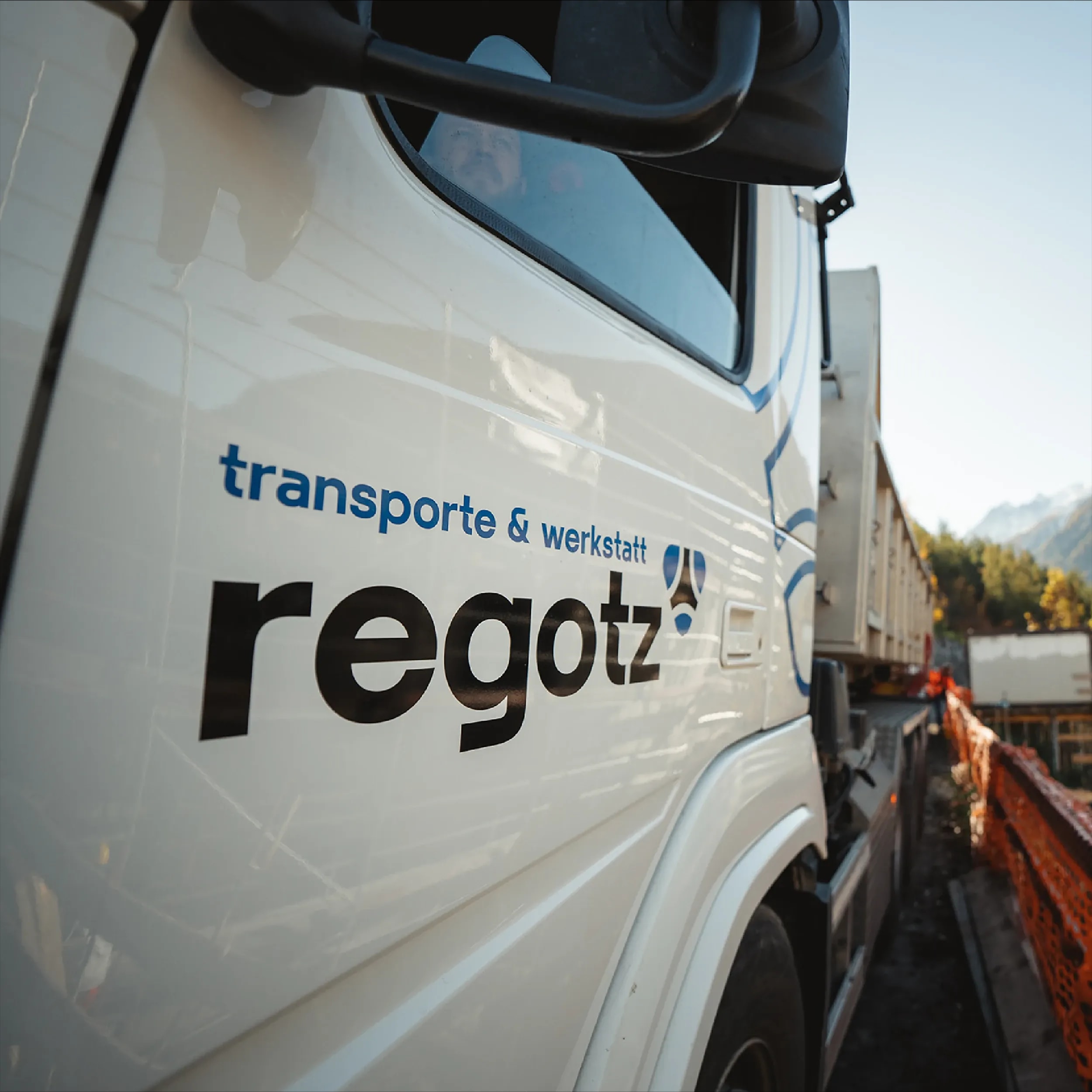
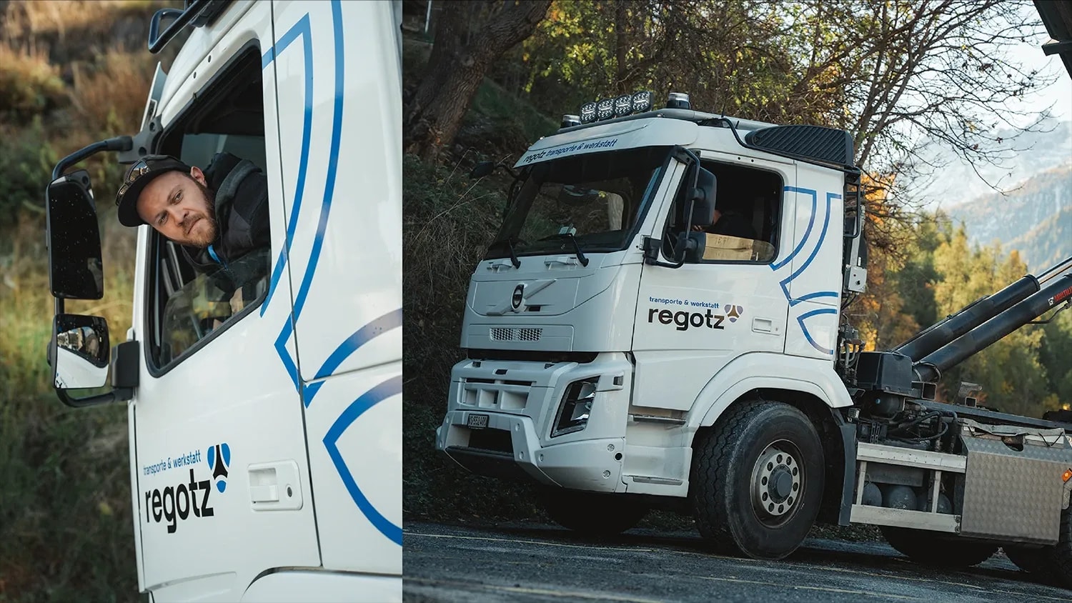
Through Future Flight, we worked with Regotz Group to develop a shared vision for the future and sharpen its strategy and positioning. From this, we developed a brand strategy that brings all five companies together under one roof. The ant is the symbol that connects them. It stands for unity, teamwork and the strength of each individual. We turned it into a pared-back brand mark that links all the logos. Consistent typography and a shared blue make membership of the group recognisable at a glance. The individual company names retain their place. The ant’s outline also becomes a large-scale design element. It features on stationery, business cards, advertisements and vehicle graphics. Construction site banners and workwear carry the identity further. For the new photography, we focused on employees at work: on site, behind the wheel and operating heavy machinery. The shared website brings together the companies, their services, projects and people. ‘Solide gebaut, für Generationen gedacht’ — ‘Solidly built, designed for generations’ — sums up their approach.
wow
Separate identities have become a recognisable family of brands. Each company has its place, and the group has a shared face. On a truck, online or on a business card, it is clear who belongs together. The identity has matured alongside the business. And the ant shows what that strength is built on: every individual in the team.